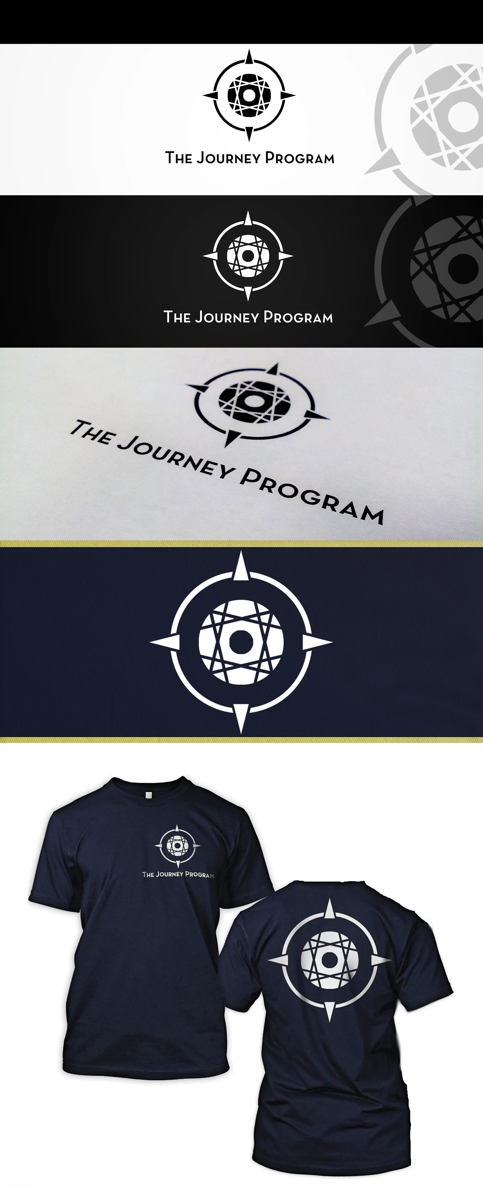
In one of my classes, we were approached to make a logo for "The Journey Program," a program for youth as an alternative to juvenile detention that helps them build confidence and their gpa. Our teacher told us to avoid using a compass. I was sick for that class. Luckily, the class unanimously agreed that my compass was stylized enough to make it unique from other compass logotypes. I was relieved. The lines not only make up the arrows to each side, but represent the paths that we all take and how they interesect from time to time. This was the runner up choice from the group.
©2026 Valency Graphics.
All rights reserved.
Privacy Policy